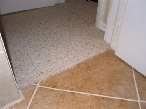
Typical tile layout advice is:
- Measure off of each wall
- Find the center of the room
- Draw intersecting lines
- Start tiling from the center intersection
You’ll find this type of information on many DIY sites that also have tips for cleaning out your gutters, staining your outside deck, and painting your ceiling. But let’s put this advice into practice in the example below:
This post deals with tile layout as a concept. If you are looking for a more How-to, nuts & bolts post then be sure to check out my related post on Bathroom Floor Tile Layout in 5 Easy Steps.
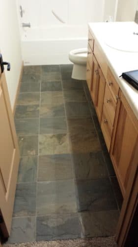
Why not have a centered tile layout?
A rectangle. Why is a rectangle with a centered tile layout wrong? Let’s see what it looks like here in the image:
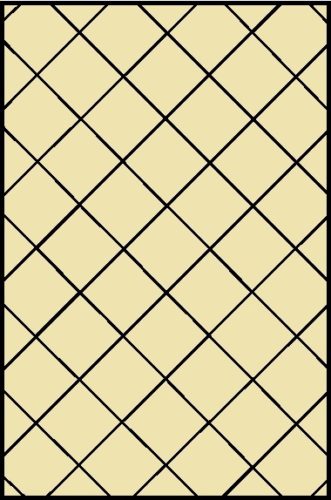
Looks great to me!
Now let’s think about this: how many people are tiling rectangles? Perfect rectangles with virtually nothing in the room so everyone can see how perfectly centered the tiles are?
While there are rooms like this let’s take a look at some imperfect rectangles that people are installing tile in, like this one:
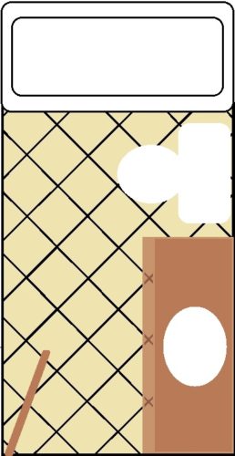
This type of rectangular room is in many homes and it’s called a bathroom. Take a look at the layout of the tile.
Technically, it’s still the same centered layout but most people won’t care to look behind the toilet at the cuts of the tile and notice how centered they are with the wall on the right.
This is why conventional centering advice isn’t always the best way.
Once you get real-life “stuff” in the room a centered tile layout loses its impact.
If a centered tile layout isn’t optimal then what is the best way to figure out how to layout your tile before installing it?
Floor Tile Layout Principles
Before we get to another diagram let me share a few layout principles that I use when figuring out what will work best:
Layout principal #1: Centering is best (when it’s noticeable)
I’m not against centering. In fact, I’m all for it when it makes sense to do so.
I find that I center walls more than floors. Kitchen backsplash layouts are often centered. Floors generally have too many obstructions in them to justify a centered tile layout.
Walls generally have higher visibility so the back wall of a shower should be centered. A floor? Not necessarily.
Layout principal #2: Start with a full tile in the entranceway
I would tell the other installers that I work with that they are to start with a full tile in the doorway or have a good reason why they didn’t.
I would estimate that 90% of the floors that I install have a full tile in the entranceway. Keep in mind that I work almost exclusively in residential homes.
The tile in the entrance to the room will always be open and visible and will also be visible from other parts of the house.
Layout principal #3: Identify one or two focal points in the room
Another word for focal points might be priorities. Try to identify the most visible spots in the room.
Sometimes you may feel that in front of the vanity is the best place to have full tile. It may be the longest wall. It may be in front of the tub or shower. It may even be the center.
Try to identify these one or two areas and look to start with full tiles at these points.
These aren’t hard and fast rules.
Sometimes following these principles may lead to small ugly cuts elsewhere in the room and compromises will have to be made.
But typically, these are the principles I use when I start to layout a floor and I’ll see if reasons come up as to why they won’t work.
Now back to our rectangle bathroom
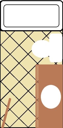
If I were to layout this bathroom, I would start with wholes/halves on the left wall (most visible) and a full tile (and halves) in the doorway and then see what the consequences are of that layout.
Behind the toilet doesn’t matter. Underneath the vanity doesn’t matter. There’s often a mat in front of the tub.
Every once in a while it won’t work out but I feel that this is the optimal layout for these types of bathrooms.
An alternate way of doing it that I would consider acceptable is to have full tiles directly in front of the toe kick on the vanity. That way, when you’re standing there, you would be standing on full tiles.
I would be more inclined to go with this layout if the tiles were set square (not diagonal) and if they were large tiles. It would also depend on the types of cuts it left on the left side wall.
Centering your floor tile layout isn’t wrong
It just may not be the best way to take advantage of the focal points of the room.
I just get irritated with the overly simplistic advice on some of the other DIY sites. Let me know what you guys think in the comments down below.
Read this if you want to know how to calculate the square feet of your tile floor.
5 Ways to Screw up your Cement Board Installation on Floors
Why Schluter Ditra is so cool: Uncoupling membranes explained
